My Favorite Web Designs Approach To Design and Development
Video Transcript
“Hello, this is Josh with ‘My Favorite Web Designs’ of Mesa, Arizona. And I wanted to talk to you today about our design process. One of the questions that we frequently get asked is, what is the process for a new website or a website upgrade, that is a website that is being redesigned. What is the process that we go through in putting out that new website?
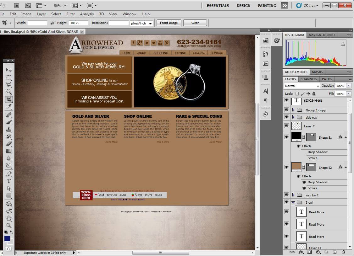
So, to start, I am going to show you my website the ‘My Favorite Web Designs’ website, which I am working on a new face for. A good web designer always likes to make his website an evolution because of course, your work should be evolving, never staying stagnant. You always have to be abreast of changes, and take advantage of new technologies and that is my plan here. Alright, so, the first thing that we would do in redesigning a website is to work on the graphics for the new design. This is typically done in Photoshop. You could do it in the website itself but it would require coding each individual part that you are considering implementing into the website, and that would be a lot less cost effective than simply mocking it up in Photoshop. Some web designers and development companies do like to use wire framing. We can use wire framing but we prefer to wire frame graphically.
Your average client will be better able to visualize the overall marketing message if they’re able to see it, rather than to just slot out areas where information will go without seeing how that comes together aesthetically and design wise. So, we do do a graphical mock up which contains a wire frame within it and I’m going to show you an example of that. Here’s a project that we were working on recently. And as we will see, we, in Photoshop, put together different elements. We have a logo here. We have the navigation here, that we’re working on. And we’re able to very easily manipulate these things through Photoshop. You can see we laid out a section for a banner. This will typically be a slider or an animated element. Below it, we put a sample of some other information that could be placed there and some formatting for it. One of the key elements from the Photoshop mock up is going to be your header element and your footer element, which will stay relatively static throughout the site.
So, those are the two key things to look at. The sliders are also very important but as for the information on the main page itself, it is modular. It’s very easy to swap out components and information. And it’s the expectation that most companies will be somewhat dynamic and will have new products and new offers that they’ll want to update onto the different pages. And we allow for that. So, in the mock up we might suggest content or we might just put filler text, but it’s understood that the key thing we’re analyzing is the fonts, the colors, and the overall aesthetic appearance of the new site layout.
So, that’s all done in Photoshop. After the Photoshop mock up is approved or is very close to being approved, we can start building it out into an actual website. One of the huge advantages of WordPress is we’re able to deploy another website concurrently on the same content. And I’m going to show that to you on my website. So, here we are on the backend of my website. And I’m going to go to the Themes folder. And you’ll notice that I have other themes in here. So, I’m going to activate the new one. Actually, I’m going to live preview the new site that I’m working on. And that will give me a glance at the appearance and the ability to look at what it is that I’ve designed. Because if I didn’t have the preview ability, I wouldn’t know if everything was perfect for when it was deployed.
So, we’re able to fully test our creation before we deploy it, and make any necessary tweaks before we make it live. So, that’s part of the process; is building out the theme, that you’ll see back here on the backend. Of course, once the theme is completed, it looks like this on the front end. It’s completely impossible to tell that it’s WordPress. It doesn’t have any indication or any URL’s that would hint that it’s WordPress. But, you will notice that once you are logged in a control bar appears over the top. The control bar is extremely useful if you want to edit a page, you can edit any page right in there. If you want to add a new page, you can simply go Add New Page. If you’re writing a blog and you want to add a new post, you can go through here.
WordPress is great for this because it also has mobile applications. I personally like to do a lot of my writing by voice to text and I do that with my mobile phone and the application for WordPress on mobile phones is terrific, very easy to use. So, that’s part of the process. We build up the theme. We start laying down the text. You’re able to edit the text as we lay it down. We can go back and forth for edits. Typically, at this point the client would provide us with photos that they would want used on the different pages. And we can add them in galleries of different sorts. WordPress has a lot of different display options kinda built in. Here’s an example of a Light Box gallery. That’s a very nice, easy to use, interface for your customers.
This is another example of featured images from WordPress posts being pulled in dynamically and then displayed and we used Cascading Style Sheets to turn it black and white and then have the animates colored which we’ll be completely redoing this section on the redesign, but very cool functionalities, cool features. So that’s part of the process; is adding the content and going back and forth with the clients to perfect the pages. As to limits, clearly it’s simple to add pages, we can adjust the navigation for you or put a dynamic navigation in that you’re able to tweak out yourself very easily. There is unlimited amounts of customization that really can go into your site. So I recommend getting a redesign in WordPress that way you’ll be able to manage it, upgrade it and continue to extend it as your business grows.
Another common question that is asked is concerning the time frame for building a new website. A new website design typically takes about a week to two weeks during the graphic process and then another two to three weeks during the build out of the WordPress Theme. Now this is variable depending on the level of detail that is required in the new site, the number of extra features that are gonna be going into it and the length of time that is required for getting responses and feedback approval from customers is always factored into that time estimate.
One other issue that can come into play with the time frame is change orders, clearly if there are changes from the original plan or major deviations from the original design, the extra work to be performed may only be an extra five or six hours but if it comes into conflict with other commitments in the schedule, the change order might take slightly longer to deliver even though it is only a four or five or six hour change order. So generally speaking new websites start to finish take about five weeks but there are situations where it can take seven, eight weeks depending on variables like change orders, getting information back from clients and getting approval on designs. And there are instances where it can be done in as little as two to three weeks when we have rush requests from customers and we can accommodate rush website design requests as schedule allows. So be sure to check the current design load when you start your project, we’ll be very upfront about the number of projects that we’re doing and how long we’re estimating that your project will take but generally speaking, it is going to be about five weeks.
When designing a website a customer often wants to know what the cost will be and what is included in the price. This isn’t always a cut and dry answer, we do account for a certain number of hours in designing each project and we have standard elements that are figured into any design. We do account for a slideshow on every website because that’s a good promotional feature for a homepage and we account for that in our initial budget. We also account for at least one contact form in your initial budget and we often will account for a contact form on the contact page as well.
We do also plan on up to twelve pages of text, many clients will require more than twelve pages which can be added very easily by the client or My Favorite Web Designs on an hourly basis. Things that might not be included in with the design would be custom graphics for pages aside from the main page or in addition to the key layout components for instance, this client needed pictures of all their lawyers cropped out, sized consistently and name tags made which required a couple of extra hours. But many of the elements are already included, social media links would be standard on any website and included, a footer is included on any website but for instance if the client had integration with Google Plus and they wanted to do the Google Plus plugin, we might charge extra for that or in this case we did a sitemap with the custom drop down feature and that might be an extra.
One of the ways that we determine whether or not we’re going to charge a change order an extra is based on the number of hours put into the project already. If we’re under hours, we will not charge change orders under any circumstances but if in the design process and the process of building out the website, we’ve already hit our hours quota, then we will talk to clients about charging for things that go above and beyond the initial project scope. So by and large we do stay away from change orders, we try to stick with our original quoted price, but on the same token if additional services required, we don’t ever want to not provide that service; we’ll simply provide a cost estimate, be up front about it and then deliver the best possible service. And that is our basic cost structure.”
Be sure to ask about our marketing services that can make your website as successful as possible, such as AZ SEO by My Favorite Web Designs.
My Favorite Web Designs – Joshua Jacoby
1006 N. 92nd Circle
Mesa, Arizona 85207
Office: 480-335-1330


Leave A Comment
You must be logged in to post a comment.